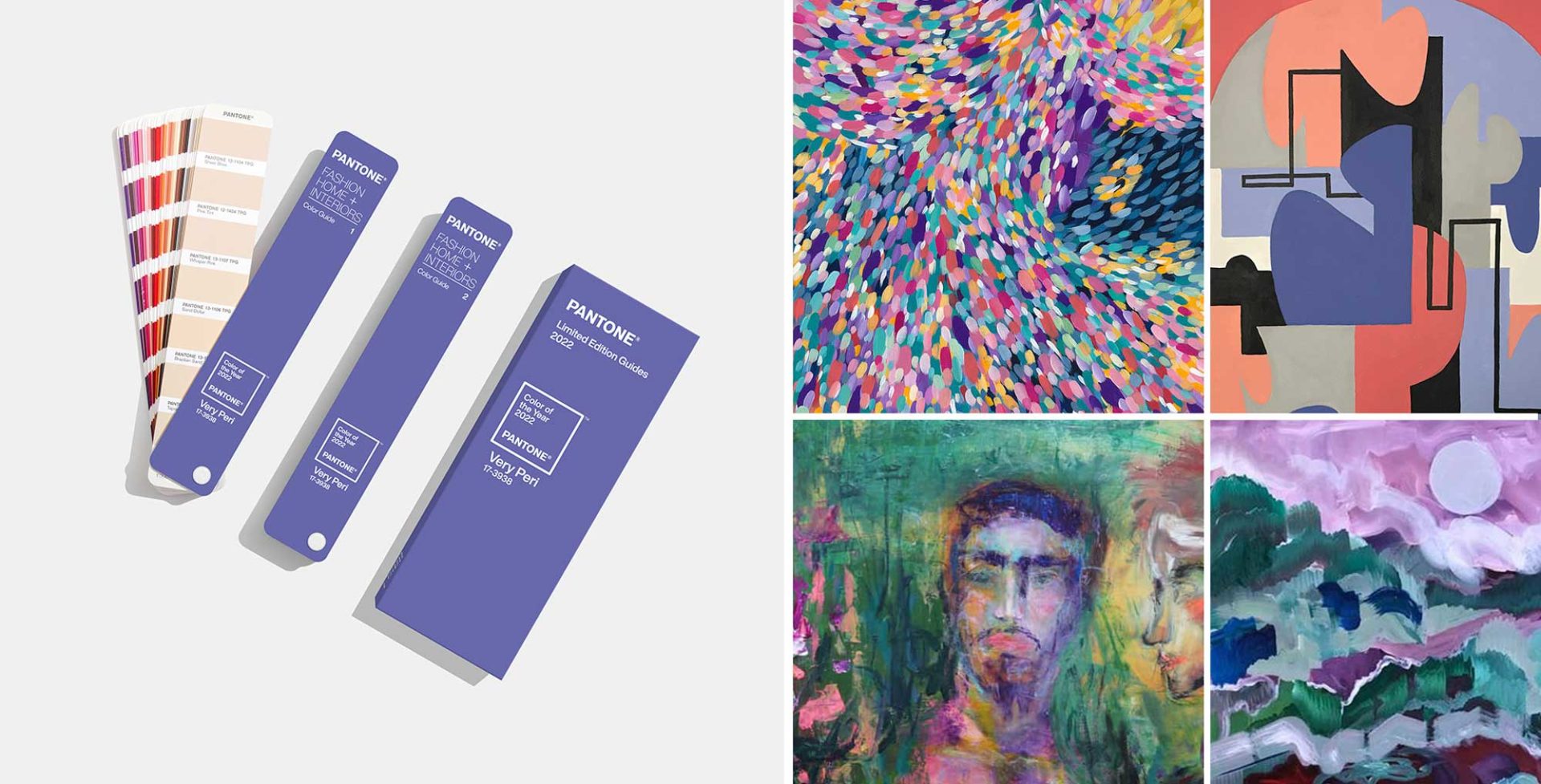
Recently the tastemakers at Pantone announced their 2022 Color of the Year: Very Peri. We love this unique, gorgeous choice and have immediately started thinking about ways to infuse our upcoming projects with this inspirational hue.
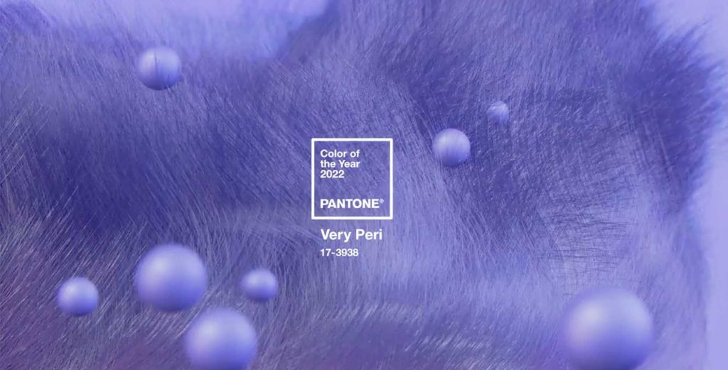
Pantone’s Color of the Year 2022: Very Peri
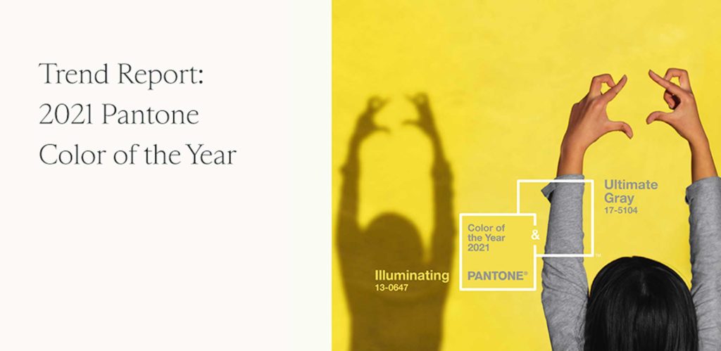
Last year’s Pantone Color of the Year was a duo meant to convey optimism and resilience. While this year has had its fair share of challenges for everyone, the message behind 2021’s colors does still feel like it captures much of this year’s mood. Before last week’s announcement, it seemed to us like a safe assumption that Pantone would select a bold, vibrant color. So many recent trend reports (including ours) have documented the rise in playful colors across all areas of art and design.
By selecting Very Peri, Pantone is signally “carefree confidence” and “daring curiosity” as driving forces for the year ahead. Executive Director of the Pantone Color Institute Leatrice Eiseman describe Very Peri as having a “spritely, joyous attitude and dynamic presence” that reflects “the global innovation and transformation taking place”.
Inspired by the new “it” color of 2022, the creative minds at KBAA have selected four artists who use Very Peri in ways that truly embrace the color’s spirit of confidence and daring. As you consider upcoming projects for 2022, keep these artists in mind and add some Very Peri to your palette.
KBAA Artist Pairings
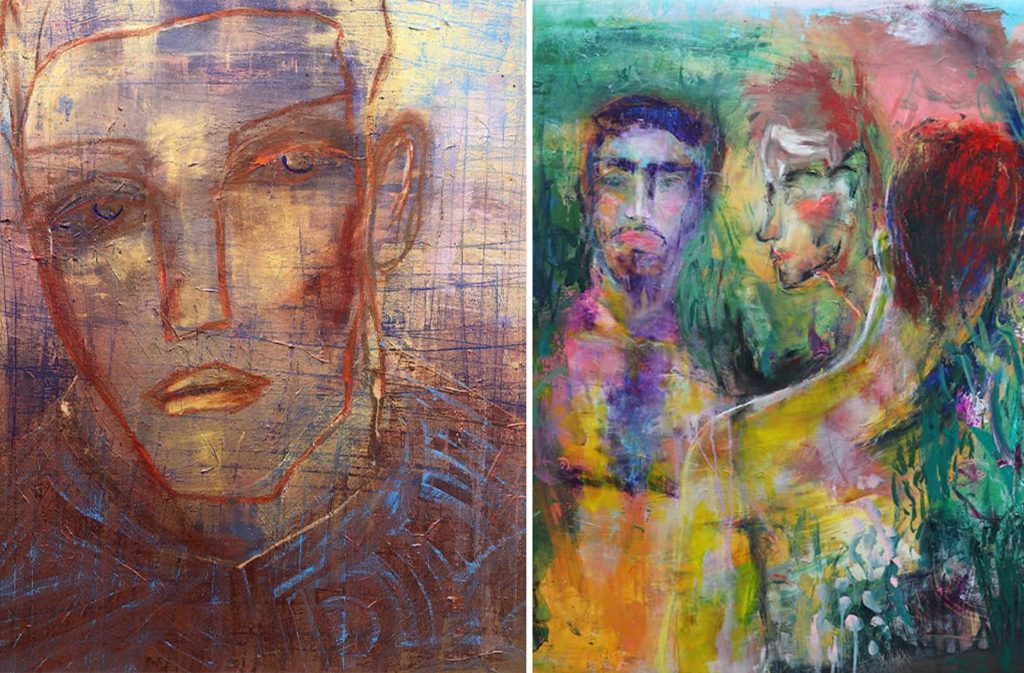
Hugo Pérez is a Houston-based multidisciplinary art whose work investigates intimacy through a queer lens. Themes in his work include masculinity, gender constructs, and the desire to connect. Pérez uses Very Peri hues as highlights in his “Modern Man” series (left) and as an attention-grabbing pop of color in this 2020 work of art (right).
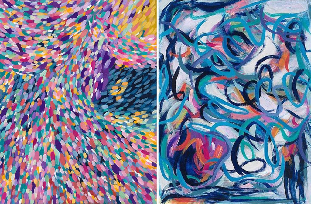
Roma Osowo is a native of the British Virgin Islands now based in Dallas whose faith drives her to celebrate color in her artwork. A painter since childhood, Osowo strives to communicate joy and love with each of her pieces. Given her signature colorful palette, it’s easy to find Very Peri in several of her paintings, including “Hosanna” (left) and “Abiding in Joy II” (right).
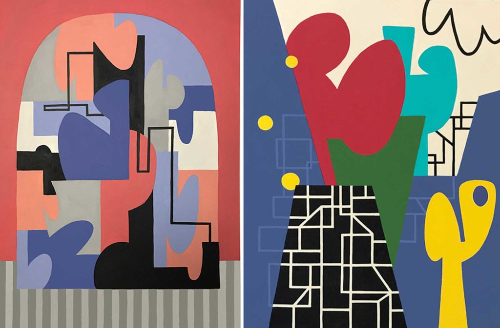
Georgia-based artist Gwen Gunter is the queen of geometric minimalism. Moving to abstraction from objective painting was a journey that led her to an unexpected approach to meaning-making in her art. Her work continues to evolve as lines becoming an increasingly important element in her art, informing the driving the painting. Very Peri can be found as one of the dominant colors in her works “My Window” (left) and “Surprised and Delighted” (right).
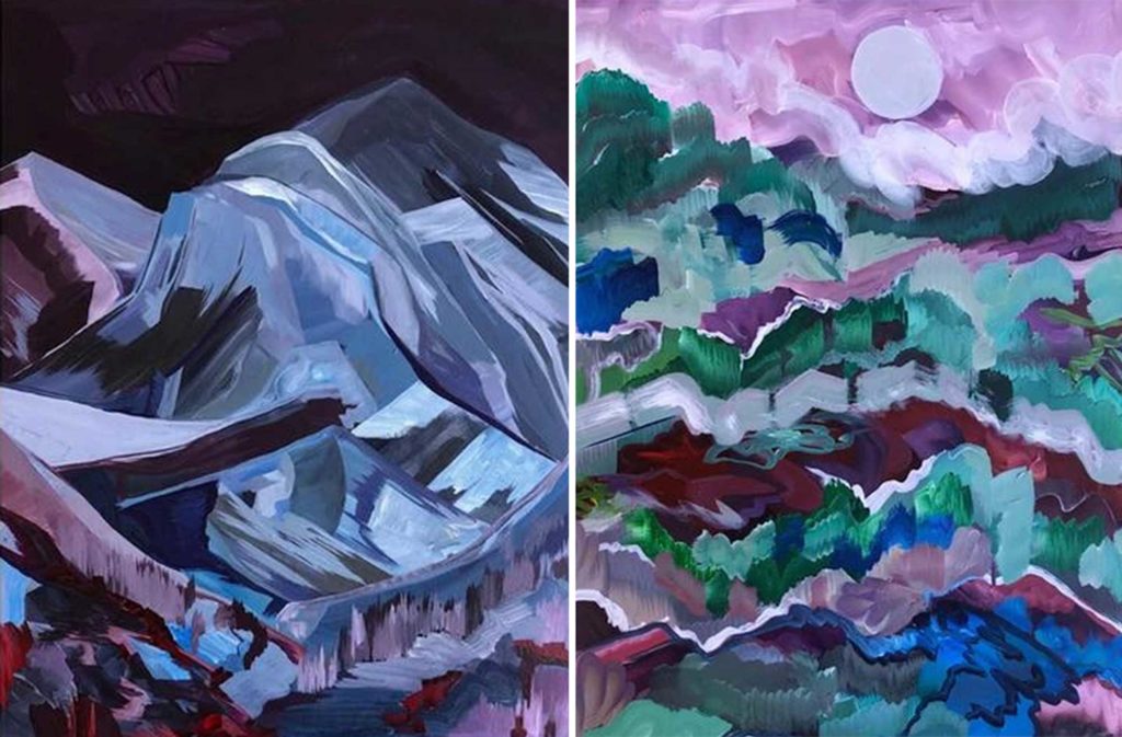
Alexander Richard Wilson is a contemporary artist living and working in the Denver area. His painting practice is influenced by his identity as a queer Black man, as well as the space and depth of American landscapes. Wilson explores the literal relationships between figurative shapes. Several works by this artist use Very Peri as a way to communicate the colorful beauty of shifting light throughout the course of the day, including “Mount Evans” (left) and the untitled nature-inspired work on the right.
If you are a fan of trend reports, mood boards, and artist pairings, we recommend the following three recent blog posts from KBAA.
