If you’re anything like us, you’ve been anxiously awaiting the announcement by Pantone of their 2021 color of the year. Yesterday’s announcement that we have not one, but two colors of the year made us doubly excited.
According to the tastemakers at Pantone, the colors of the year for 2021 are PANTONE 17-5104 Ultimate Gray + PANTONE 13-0647 Illuminating.
Choosing a color of the year is as much about predicting where trends are at the moment as they are trying to see into the future. After a year like 2020, it feels almost dangerous to try and predict the moods and mentalities of 2021. With this pairing, Pantone attempts to meet this challenge by picking colors that embody our collective zeitgeist at our human best: optimism and resilience.
In the words of the Executive Director of the Pantone Color Institute Leatrice Eiseman, “[T]his is a color combination that gives us resilience and hope. We need to feel encouraged and uplifted; this is essential to the human spirit.”
As we look forward to seeing how interior designers work these colors into inspiring spaces over the year, we have work by artists whose art plays with 2021’s hues in complementary ways.
KBAA Artist Pairings

Niqui Carter is a New York-based photographer whose work consistently pushes past the boundaries of what we think of when we hear “fine art photography”. Her alternative photographic techniques reveal beautiful, painterly abstracts that we adore. These two pieces are from her Waves and Paper Series.
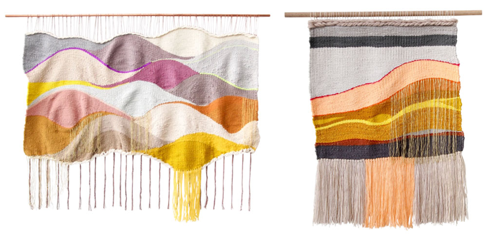
Farron Feiner is an LA fiber artist best known for her keen eye developing color palettes, using pop colors and her large-scale landscape weavings. Each of Feiner’s pieces is handmade with sustainable fibers and one-of-a-kind. These two pieces, entitled “Maria También” and “Honey”, both pair sunny yellows with calm, stable grays.
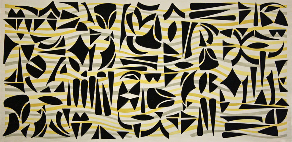
Napa Valley artist Charles Seerey’s work integrates art history influences and personal perspectives. To achieve his signature look, Seerey applies paint to produce a distinctive rendering of color, light, and texture, built up in a series of layers with elements of underpainting.
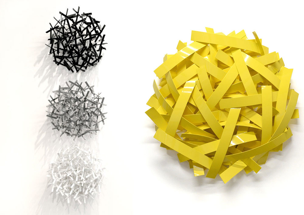
Sculptor Matt Devine is a self-taught sculptor working with steel, stainless steel, aluminum and bronze. The contrasts of nature and industry, light and shadow, chaos and order are themes found throughout Devine’s body of work. Bright yellow is a common color in Devine’s sculpture, and paired with one of his gray pieces the two are a beautiful embodiment of this power color couple.
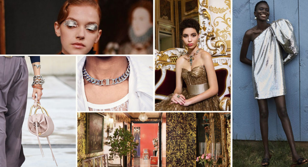
We won’t pretend to be able to see into the future, but does this color pairing remind you of our recent trend report? Read up on yellow and gray’s luxurious cousins— silver and gold— on the KBAA blog.