Spring is fast approaching, and with it comes new inspiration. We’re excited to share with you three new mood boards that we feel reflect what’s popular in art, fashion and design. Some of what we’re seeing gaining in popularity build upon our January Trend Report, while others show how much our collective mood has shifted in just a few months into 2021.
Join us for a deep dive into the colors, patterns and textures that are in bloom this spring.
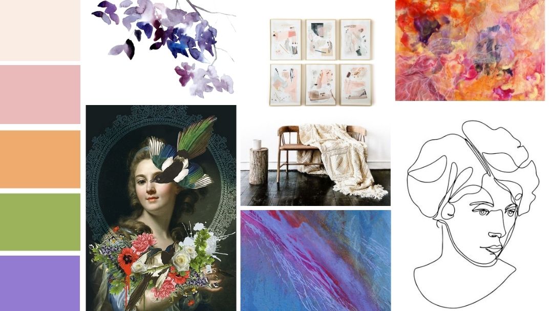
Spring Forward
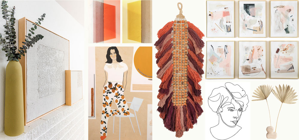
Shades of purple are popping up in mood boards across the art and design world this spring, with Pantone’s Purple Rose leading the pack. Our “Spring Forward” mood board is anchored in shades of purple with pops of color designed to spark energy and lift spirits. For this mood board we paired Purple Rose with other popular Pantone colors like Marigold and Firecracker to create a vibrant palette that exudes optimism. Texturally, we love these colors paired with kinetic applications like daubs, gouache, and dripped paint.
Featured Artists (clockwise from top left): Sandi Hauanio, Christine Vilutis, Hill Ggin, Roma Osowo, Paul Seftel, Glenyse Thompson
Artist Spotlight: Hill Ggin
Hill Ggin is a New Orleans born and raised artist who believes that art should be a relief and not a reminder. Ggin calls on her audience to focus on the art itself, to remove themselves from the stresses of the outside world.

(left to right: “Justin”, “Tunnel Vision Haunts You”, “Pretentious With No Potential”)
Jojoba Sunset
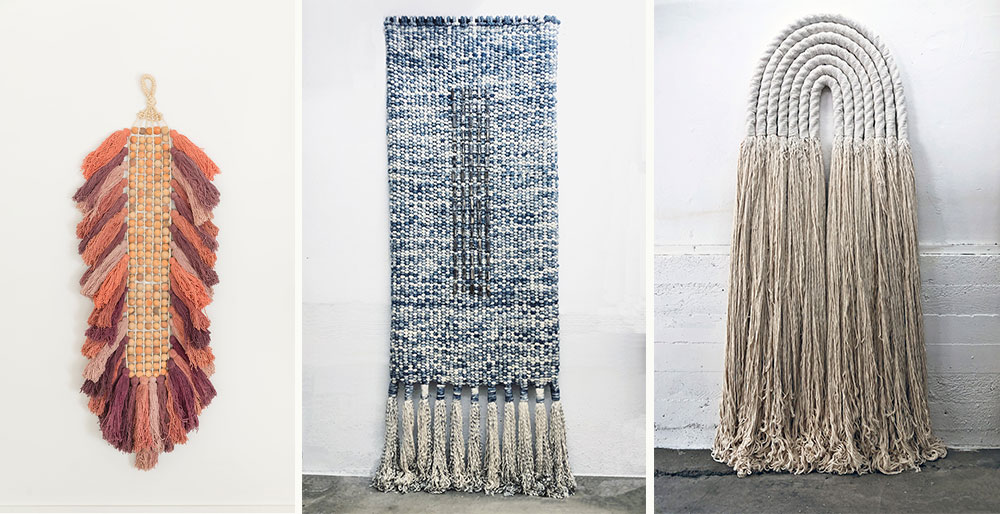
This mood board reflects a trend that has only grown in popularity since we first discussed it on the blog last year. It’s Spring 2021 and interior designers are still in love with a high-end desert, eco-friendly aesthetic. In some ways, this trend also borrows from elements of Japandi but with an emphasis on earthy hues and textile.
While “Spring Forward” is an energetic, optimistic leap into the new year, “Jojoba Sunset” reflects that nesting mood so many of us are still in. Pantone colors like Macchiato, Desert Mist and Daylily bring warmth to a generally neutral palette. Textures include natural fibers, dried botanicals, and wood.
Featured Artists (clockwise from top left): Lana Barkhordarian Burstein, Alyson Fox, Liz Robb, El Lovaas, Cindy Hsu Zell, Maggie Roth, Meredith Steele
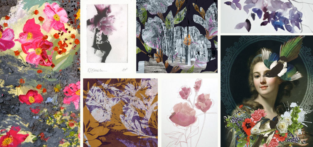
Artist Spotlight: Liz Robb
Liz Robb’s art practice focuses on soft sculpture. Based in Los Angeles, she works sculpturally to create textured surfaces and forms with natural materials such as wool, cotton, jute, and indigo.
(left to right: “Witchy Woman”, “His”, “Passage”)
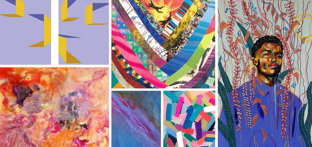
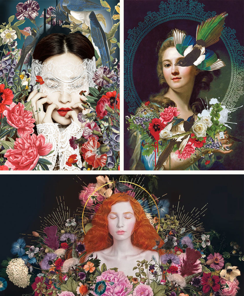
Floral Fixation
Remember the Cottagecore trend we shared in our January trend report? Our “Floral Fixation” mood board is a response to the chintz and romance of the trend, with a bit of a twist. We think this trend is most interesting when it’s less doilies and tea cups and more Vivienne Westwood. Layering a bit of edge and depth on top of the floral is a great way to develop this trend deeper as the year progresses. Pantone colors that pair nicely with this aesthetic include Raspberry Sorbet, Cerulean and the very on-trend Purple Rose.
Featured Artists (clockwise from top left): Dagmara Weinberg, Rosie Emerson, KBAA Custom Concept, Elizabeth Becker, Alexandra Gallagher, Ayaka Prenton, Ann McIntyre
Artist Spotlight: Alexandra Gallagher
British multi-disciplinary artist Alexandra Gallagher’s work celebrates the surreal and sublime. Her work looks beyond our subjective limits and often tells a story of inner imagination and thought.
(left to right: “Marie”, “Poppy”, “Omniscient”)
Looking for more inspiration and artist pairings? Take a look at more of our recent trend reports and mood boards.