Claridge House
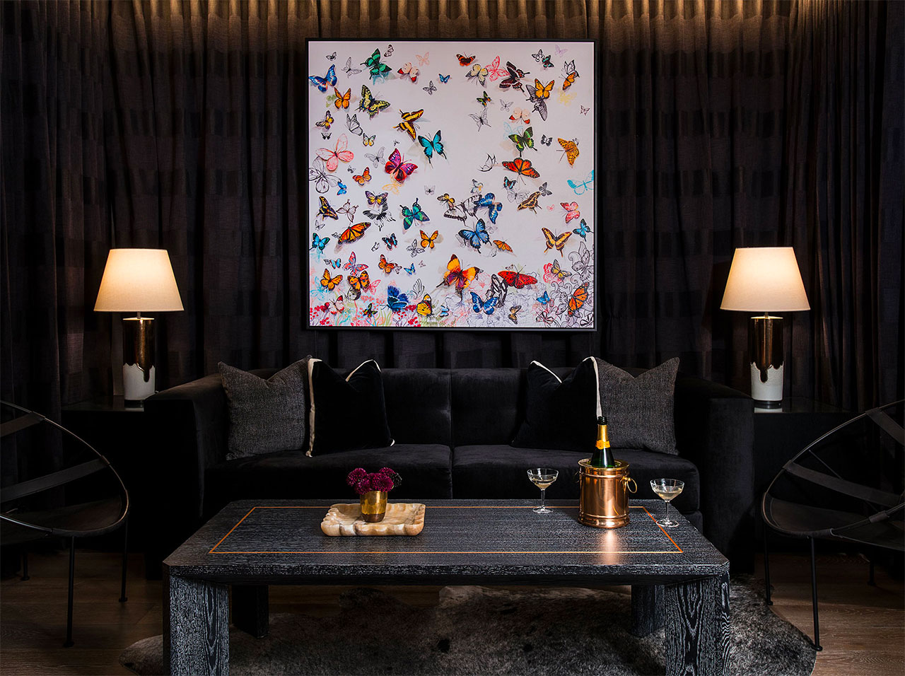
Chicago, IL Collaborators The Gettys Group Highlights Lasercut three-dimensional butterflies were individually added to a giclee for added dimensionality Project Scope Public spaces and guest roomsA historic Chicago property gets a redesign and a new name, without losing its character and timeless charm
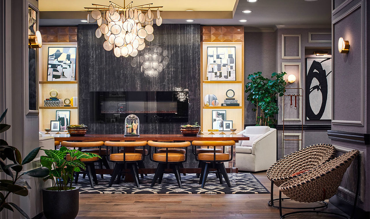
Designed in 1923, Claridge House was originally a residential hotel for wealthy Chicagoans. As part of a $9-million renovation, the redesign of Claridge House harkens back to that history. To achieve a homey yet upscale feel, our design directive centered around an appreciation for a modern take on a traditional English grand hotel aesthetic. The art advisors at KBAA worked to echo that in the art selection throughout the property, from the public spaces through to each of the 165 guestrooms.
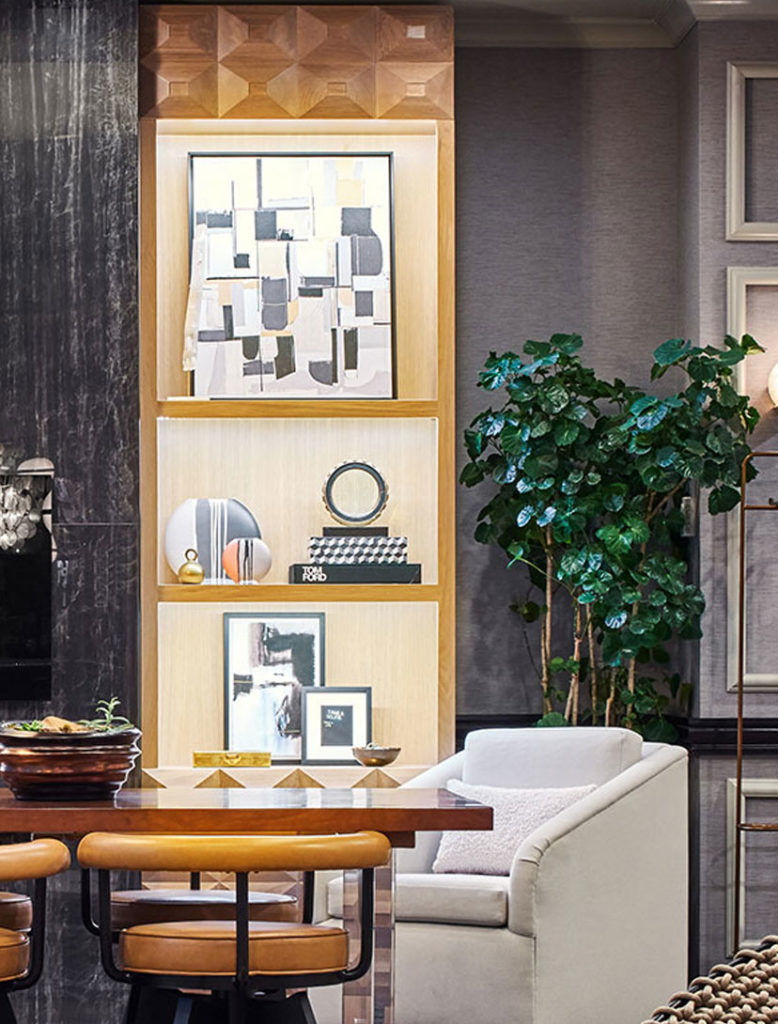
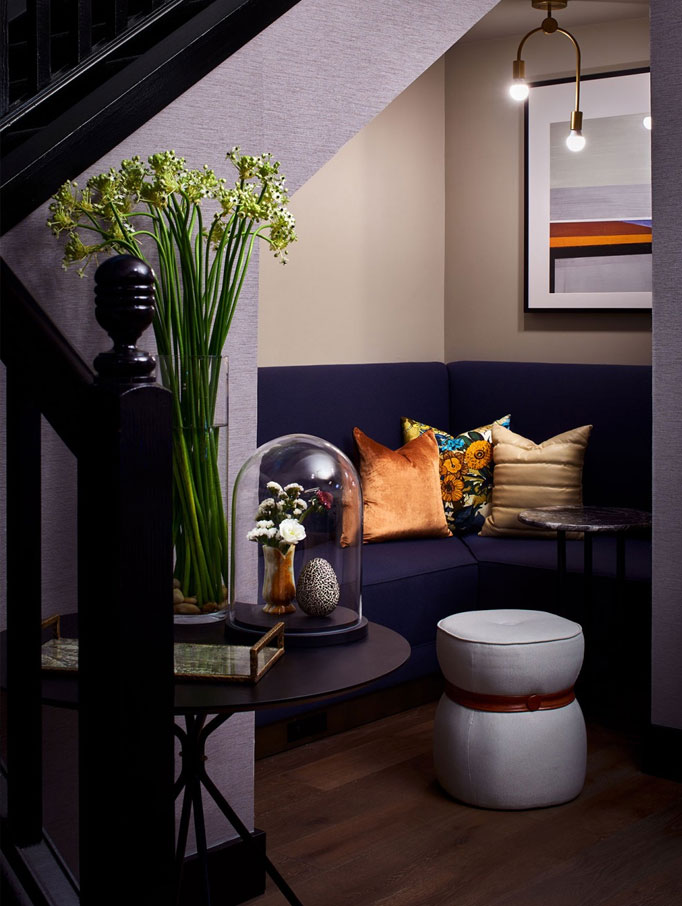
The art in the public space of Claridge House is a mix of abstract monochromatic giclées on canvas interspersed with the occasional gold-accented geometric piece. The result is a refined, understated look that keeps things polished and interesting. Further into the common areas is a custom-designed giclée on canvas embellished with three-dimensional butterflies. This piece offsets the dark, club room-like tones of the room that surrounds it with a glimpse of English garden color and brightness. This same contrast appears in a small space underneath a set of stairs, giving guests another way to experience these two themes together.
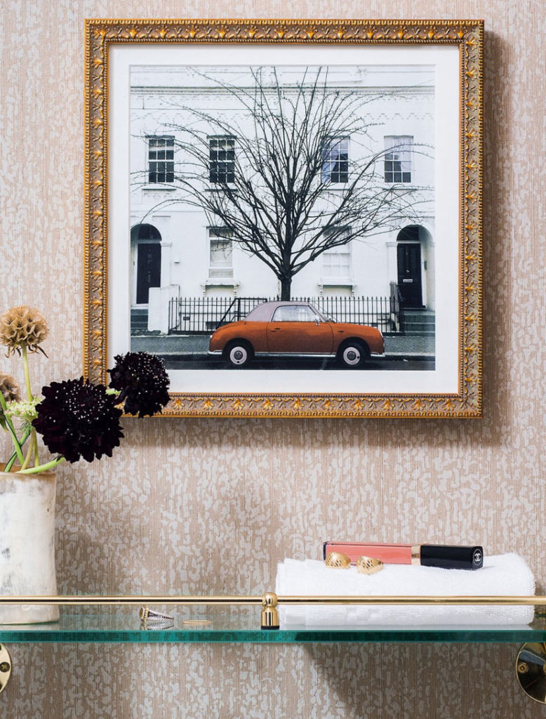
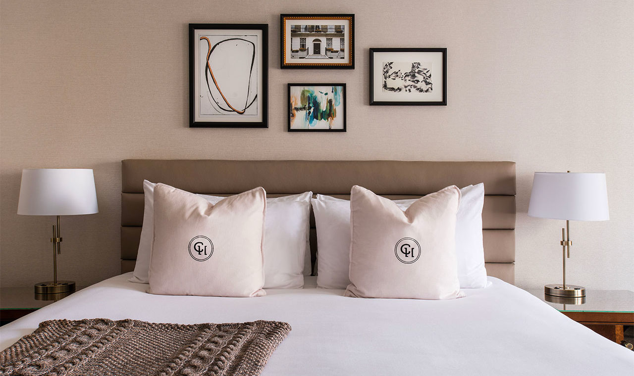
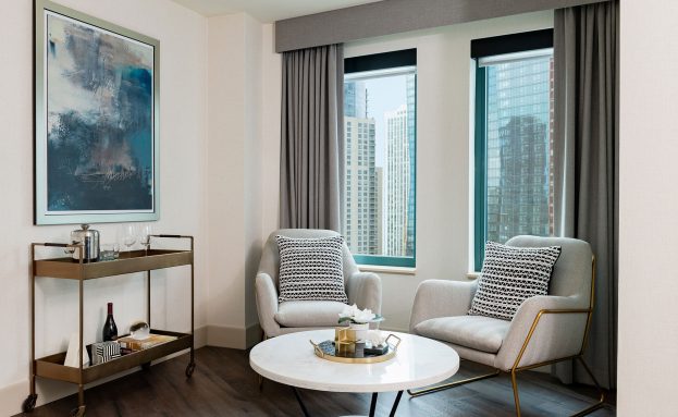
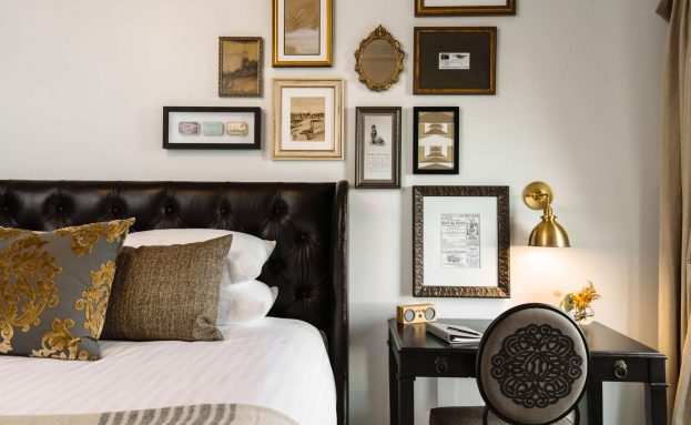
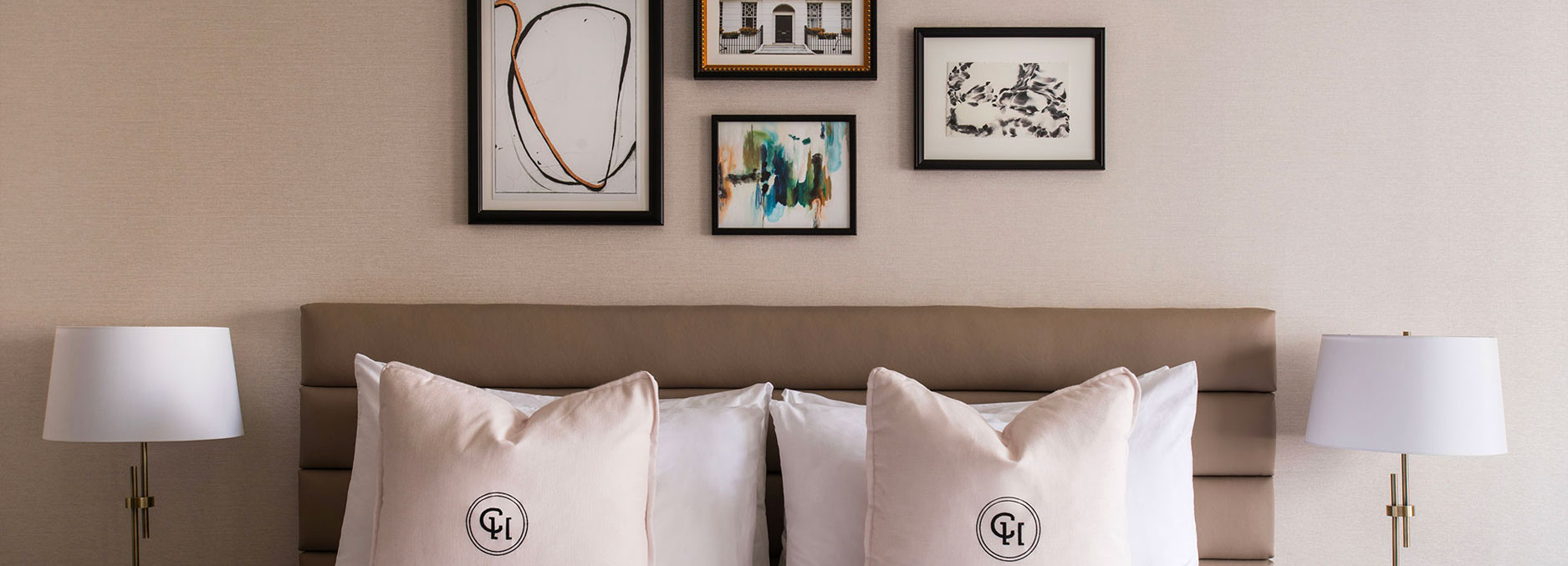
While the public spaces aren’t afraid to dive into some very deep colors, like lush blues, browns, golds and grays, the guest rooms favor warm neutrals. Gallery walls feature abstract giclées in lighter hues, and photography of the exterior of a well-heeled London neighborhood. One of our favorite pieces is actually found in the guest bathrooms, where a framed giclée of a classic tiny British automobile brings a whimsical moment to the space.
Claridge House’s redesign and art collection now offer the Chicago visitor looking for something more, an experience that is cut above, authentic and timeless.
The pied-a-terre style of Claridge House was a design directive that really resonated with our team. We love finding ways to balance a luxurious environment with a social, neighborhood feel. We hope that everything about a stay at Claridge House— including the art— gives its guests that "home away from home" experience.
– Allison M. Barry, President, Kevin Barry Art Advisory
Planning a gallery visit?
Come see some featured art for yourself at one of our galleries.
Westlake Village, CA 91361
(310) 264-7777
Las Vegas, NV 89118
(702) 948-1929
